Buttons
These properties provide options to customize the formatting of buttons.
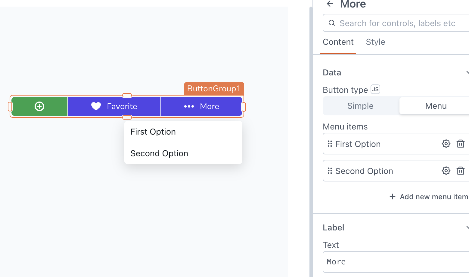
Content properties
These properties are customizable options present in the property pane of the widget, allowing users to modify the widget according to their preferences.
Data
Button type string
Specifies the type of buttons to be included in the button group.
Options:
- Simple: You can add text buttons to the group. Each button can be customized with different labels, colors, and actions.
- Menu: You can add menu items to a button in the group. This allows you to create a dropdown menu with multiple items. For information on configuring menu items in the button group, refer to Menu Items.
Label
Text string
Sets the text label for a item. It can be a static text value or dynamically bound to a datasource.
General
Visible boolean
Allows you to show or hide the menu item based on specific conditions.
Disabled boolean
Allows you to disable input for a item. This can be beneficial when you want to restrict user interaction with the item in specific situations.
Style properties
Style properties allow you to change the look and feel of the widget.
Icon
Icon string
Specifies the icon to be displayed on the button. Additionally, you can use JS to dynamically set the icon. Appsmith utilizes the icons from the Blueprintjs library.
Position string
This property allows you to configure the Icon's placement.
Options:
- Left: Aligns the Icon to the left side of the Label.
- Right: Aligns the Icon to the right side of the Label.
Placement string
Determines the spacing between the Icon and the Label.
Options:
- Start
- Center
- Between
Color
Button color string
Determines the color of the button displayed for each item in the button group.
Events
onClick
Allows you to configure actions to be executed when the button is clicked.